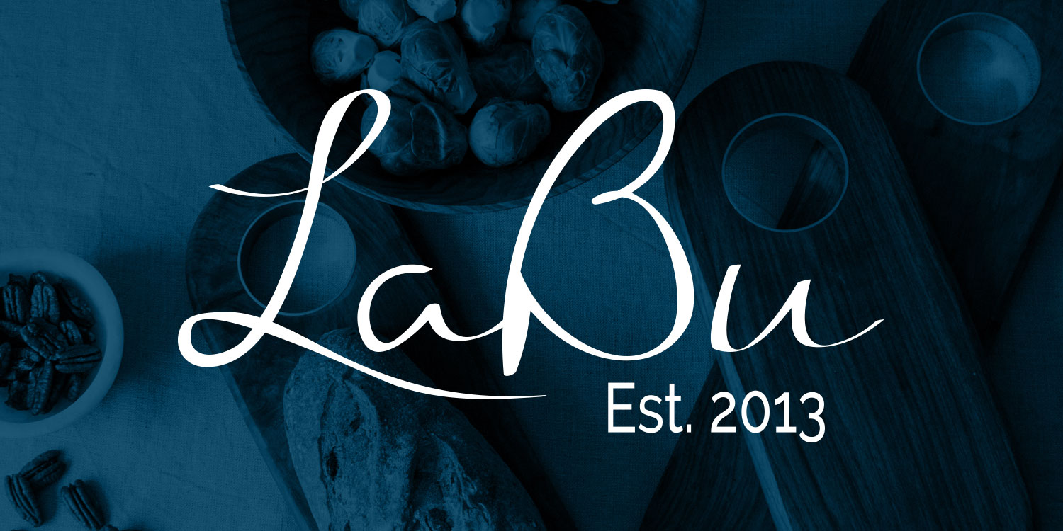
Shop LaBu
Creating the brand.
Key Responsibilities
Ecommerce website design
Product photography
Email marketing
Art direction
Brand Identity
Style guide creation
Packaging design
My Role
Logo and color palette creation, design and maintenance of the online experience, product photography, packaging and shipping solutions, and design of digital marketing assets.
The Brand
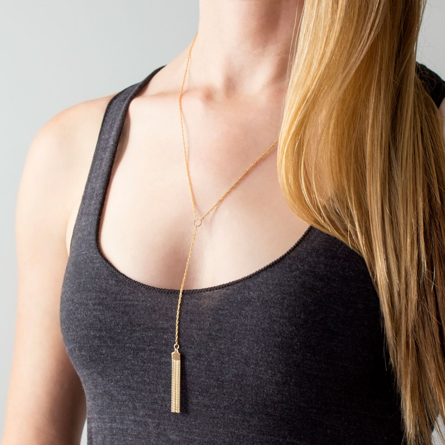
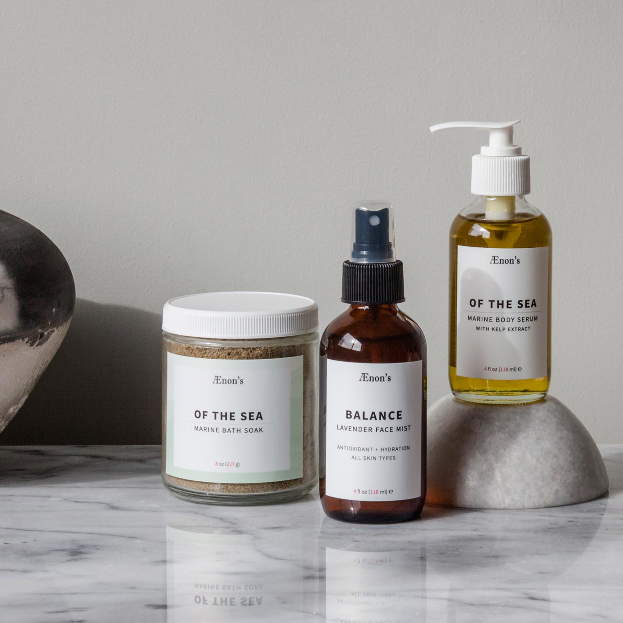
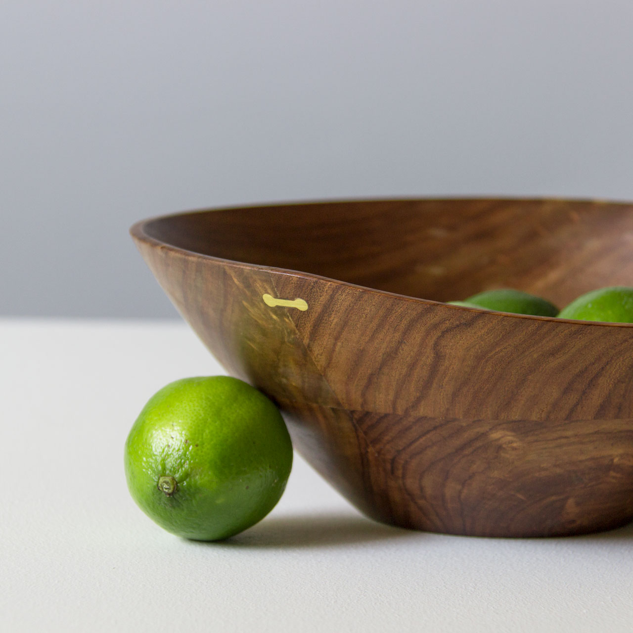
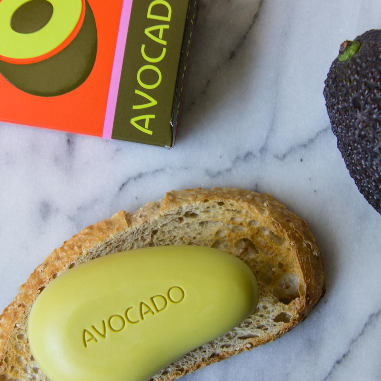
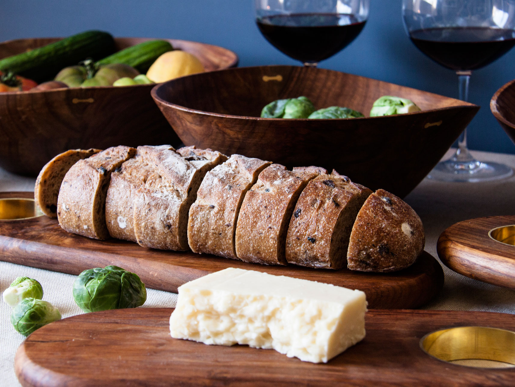
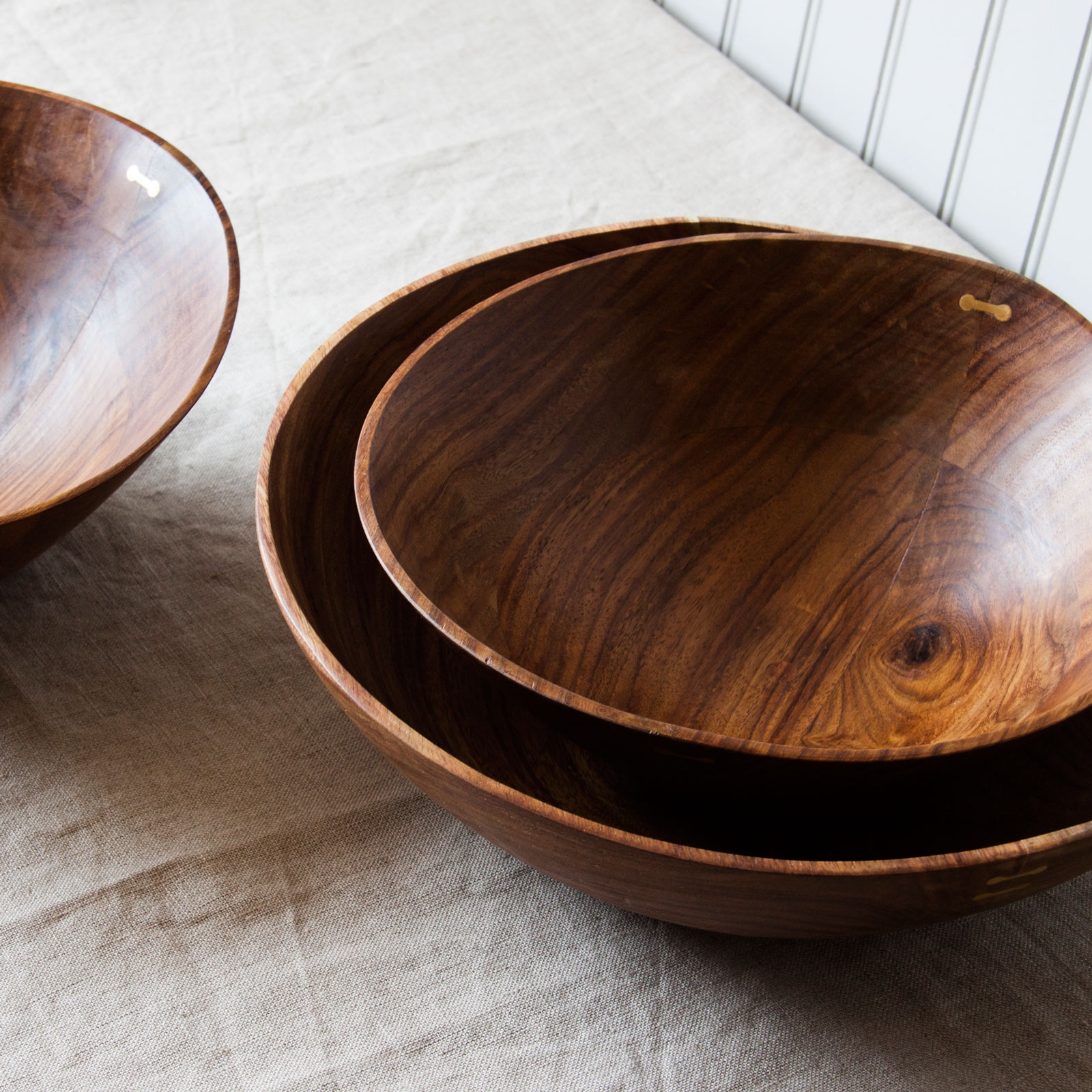
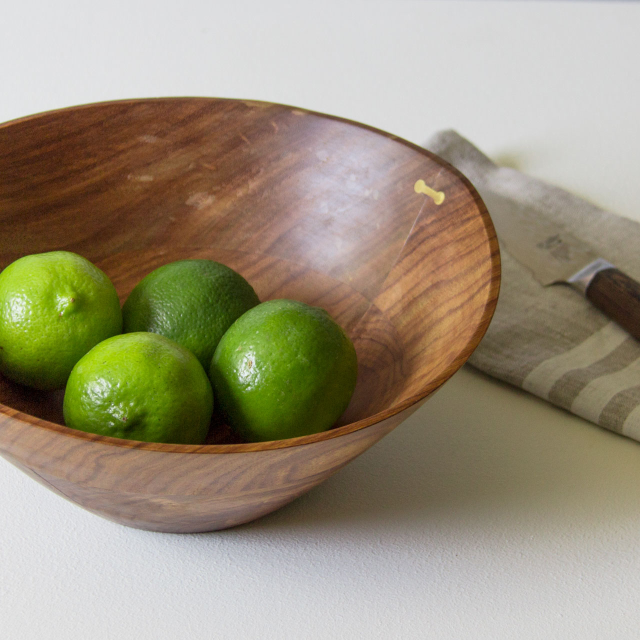
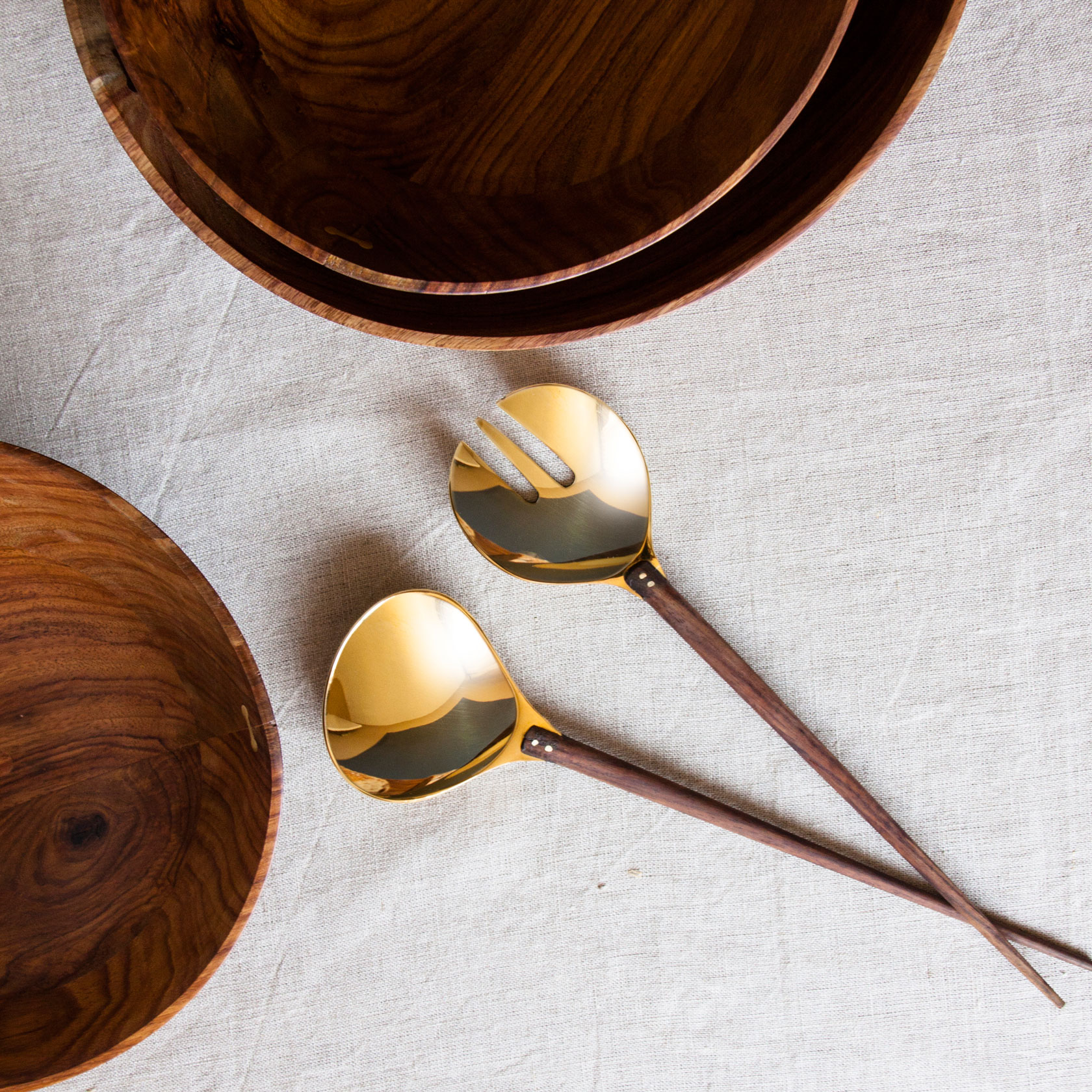
With a commitment to 100% natural, eco-friendly and sustainable, the core products are handmade jewelry, home goods and skin care. "LaBu", derived from Malibu, strives to embody the laid back mind set of the beautiful coastal town it's named for.
Target Market
The target audience is women, ages 25-44, who live on coastal US cities. Created four audience personas that resonate with different key attributes of the brand for online marketing, advertising and re-targeting purposes.
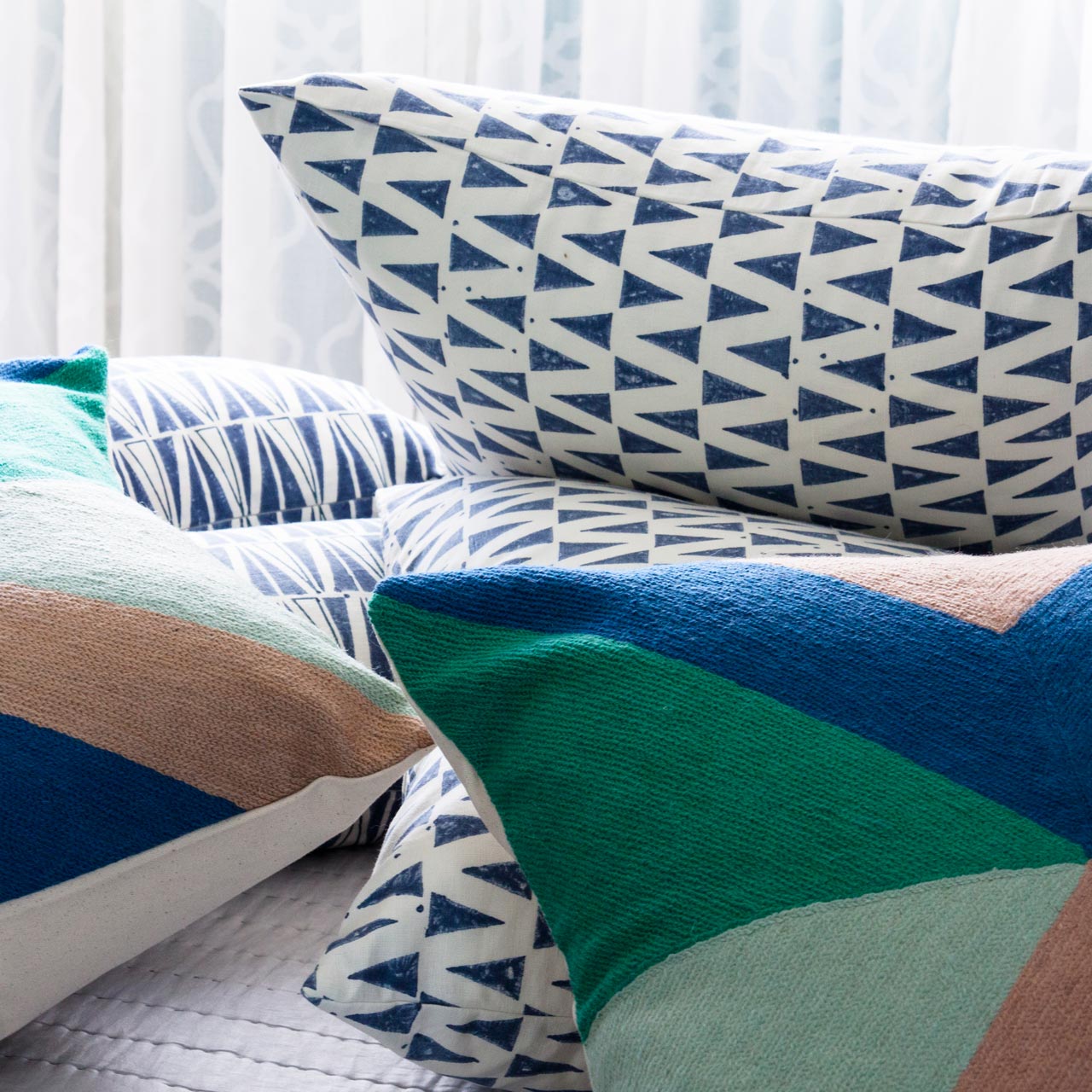
Defining Features
The LaBu brand is clean and simple with a handwritten logo to give it a natural feel that mirrors the product line. The deep blue chosen is calming and reminiscent of the sky and sea. Light grays compliment the blue and give depth to the overall look.
Website Design

The online experience was designed to convey high quality with beautiful materiality. LaBu's commitment to 100% natural products, their inspiration, and desire for a healthy planet through philanthropy was a message that needed to be obvious to the customer. Built on the Big Commerce platform, the web developer we contracted for this project and I designed the page layouts, made sure to follow best UX/UI practices and ensured clean code and small image sizes for fast loading times.
Equally as important as an immersive desktop experience was the website on mobile devices. Although users primarily purchased on desktops, the mobile site still needed to be flawless and beautiful. Checking the site's layout at multiple sizes and making adjustments, ensures the site looks fantastic on any laptop, iPad, smartphone or 4k screen.
Packaging Design
Being an online only store, the customer doesn't see this package until it arrives at their door. This is the first physical connection customers have with the brand. The art is simple. Less "buy me" marketing tactics are needed. Still beautiful enough to lure the eye of passers by though. An envelope with a hand signed thank you card and packing slip greet you first upon opening the package. The products are surrounded in white tissue and protected by biodegradable peanuts to keep with the 100% all natural theme.

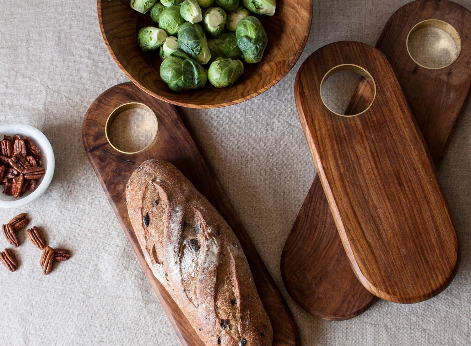
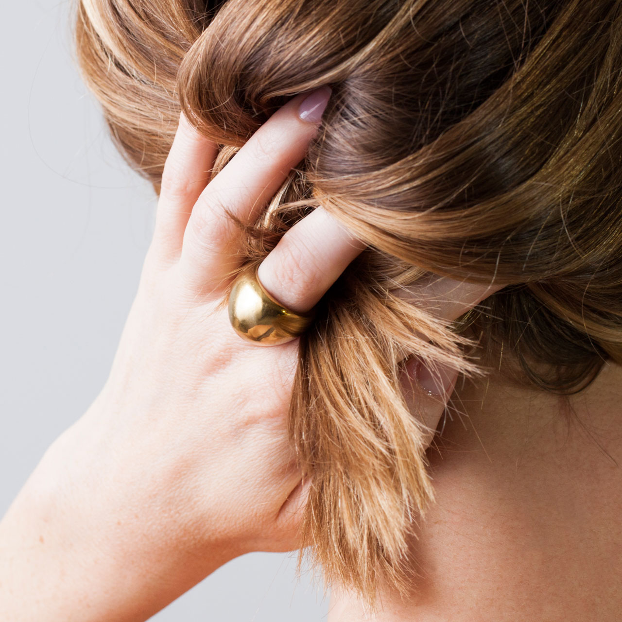
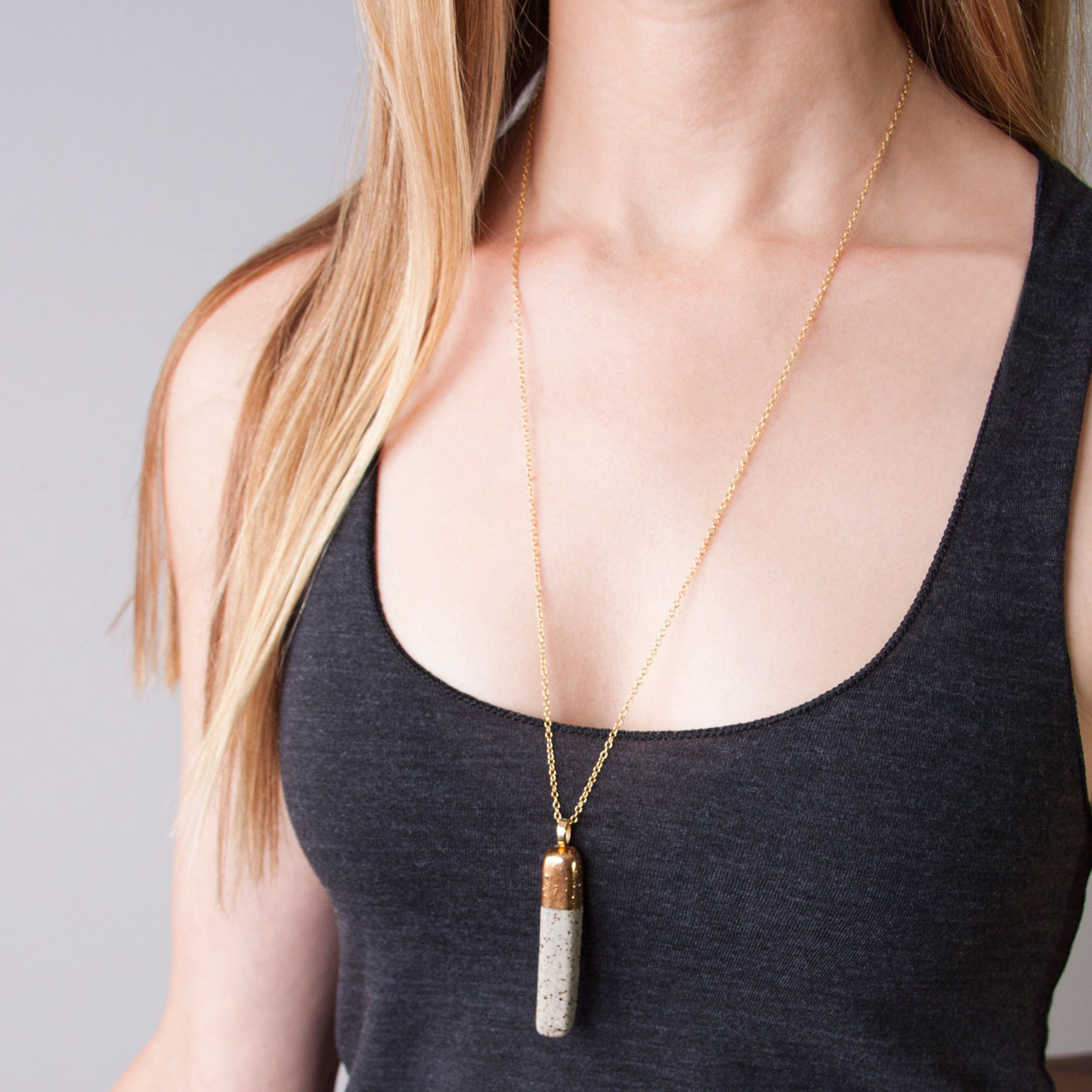
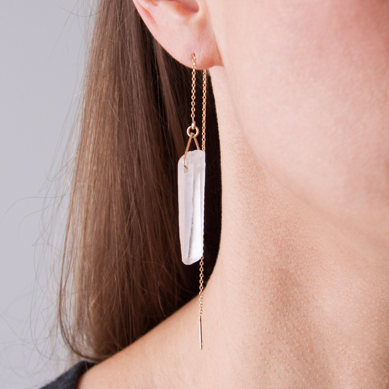
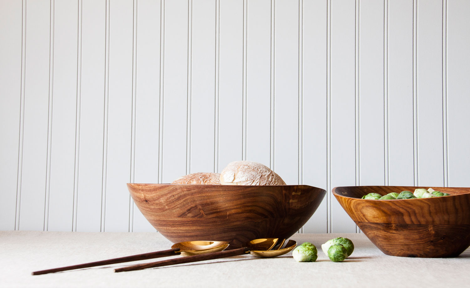
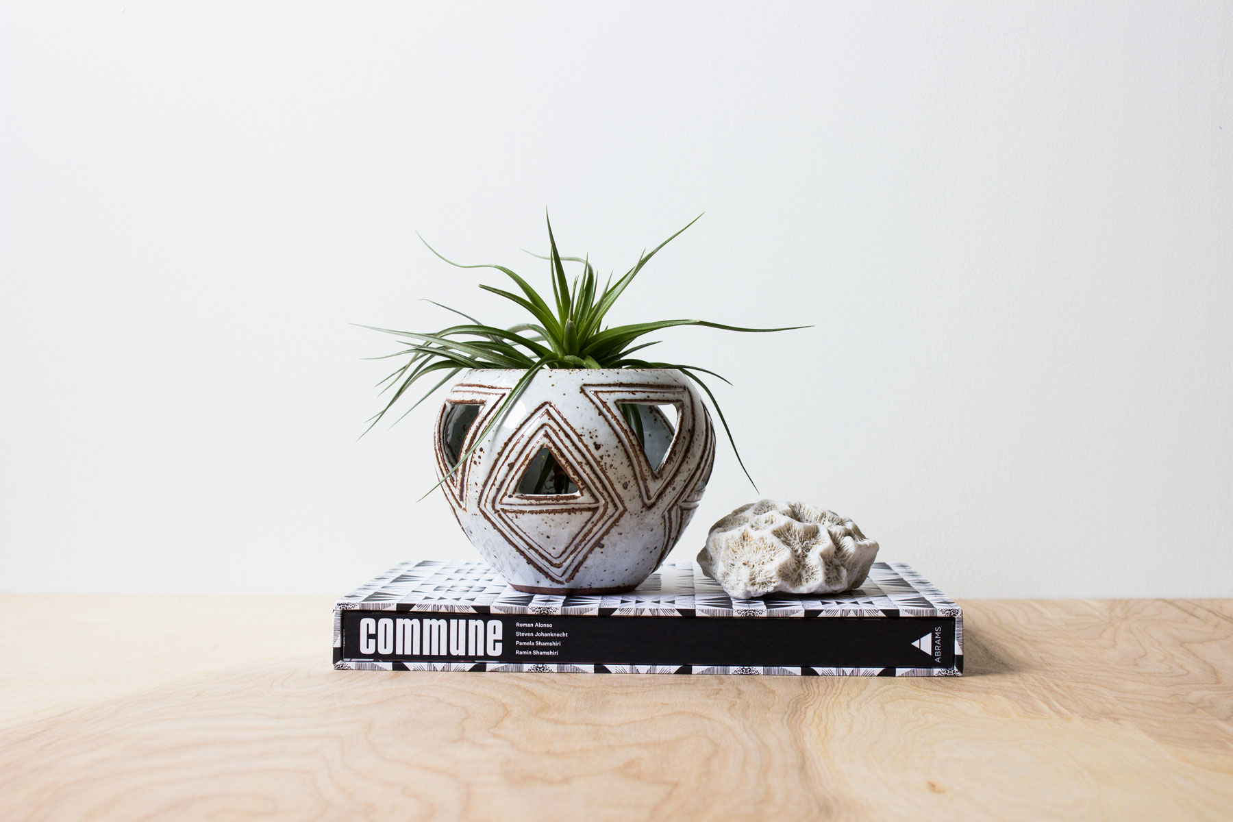
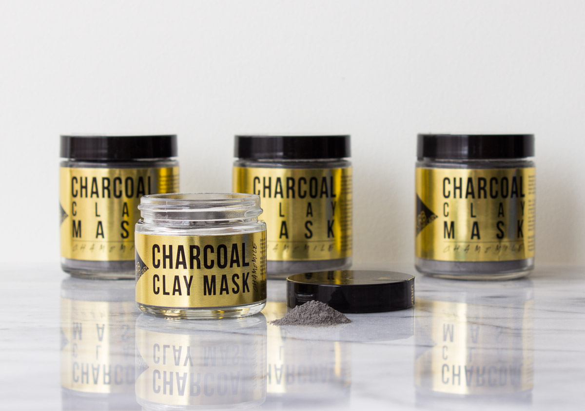
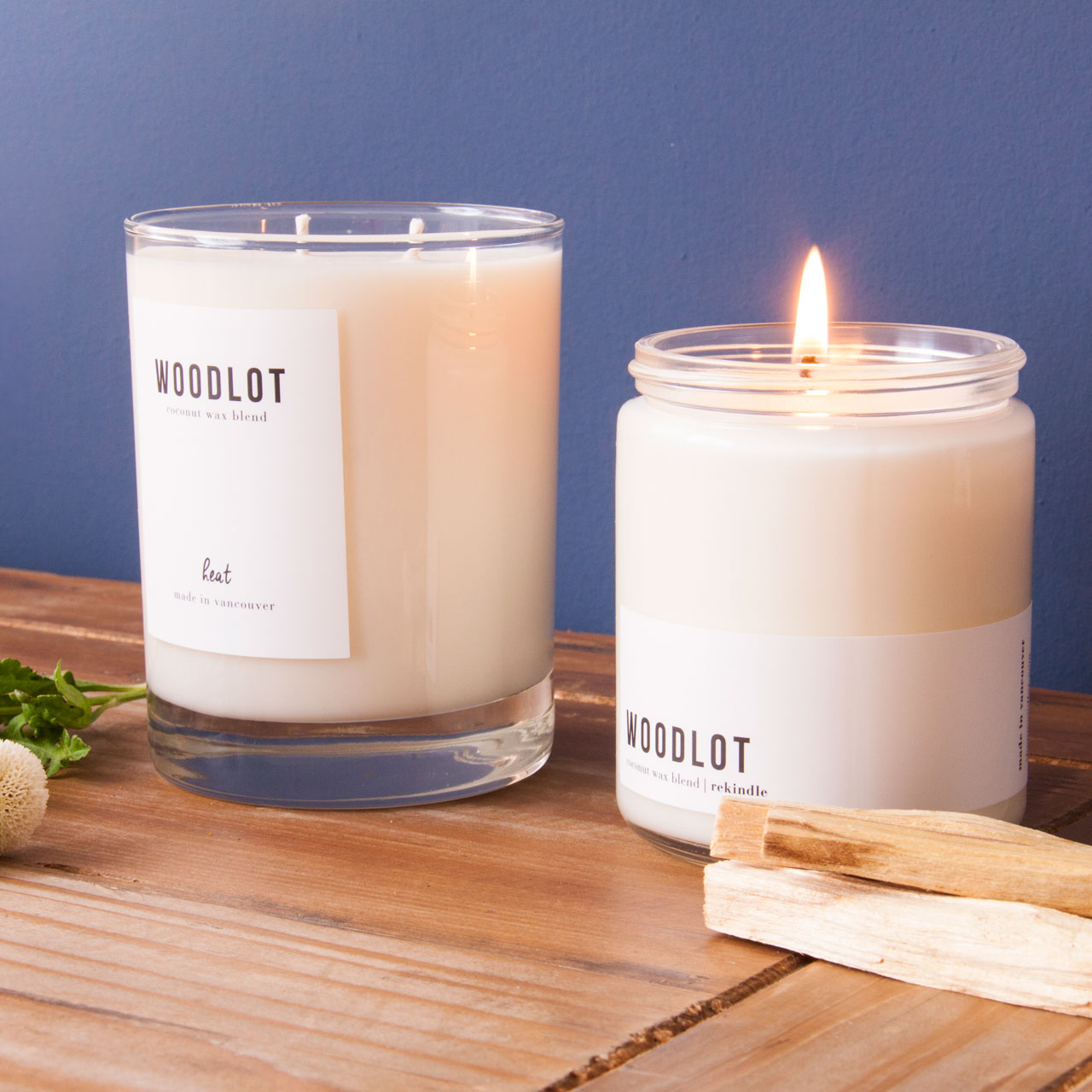
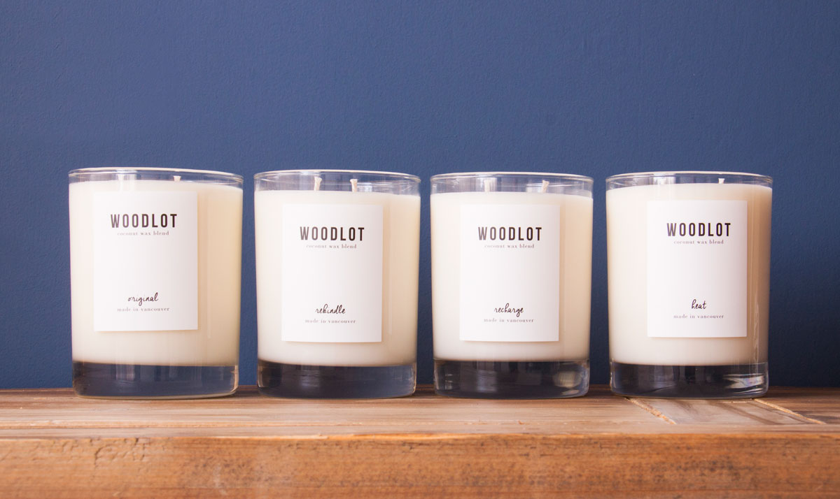
Product Photography
Product photography is an essential element to any brand. In keeping with the brand story, I made the decision that LaBu product photos needed to show products in use. Creating an environment where the customer can easily envision the product in their home was key to selling LaBu products.